Tips for Spotting Quality Thrift Store Artwork
Welcome to the Blog today, Friends. One of the things I am most often asked about when visitors come to our home is the artwork…

Thrifting the Upstate
Welcome to the Blog today, Friends. One of the things I am most often asked about when visitors come to our home is the artwork…
Welcome to the Blog today, Friends! I have a wonderful estate sale adventure to share with you today—one of those treasure-hunting experiences that reminds me…
Welcome to the Blog today, Friends. I’m so happy you’re here. “Your vision will become clear only when you can look into your own heart.” —…
“Why, sometimes I’ve believed as many as six impossible things before breakfast.” — Lewis Carroll Welcome to the Blog today, Friends. I’m so happy you are…
Welcome to the Blog today, Friends. First, let me apologize for being a bit late getting this post out. It has been quite the week…
Welcome to the Blog today, Friends. I’m so excited to share my most recent finds with you and then show you how I displayed them…
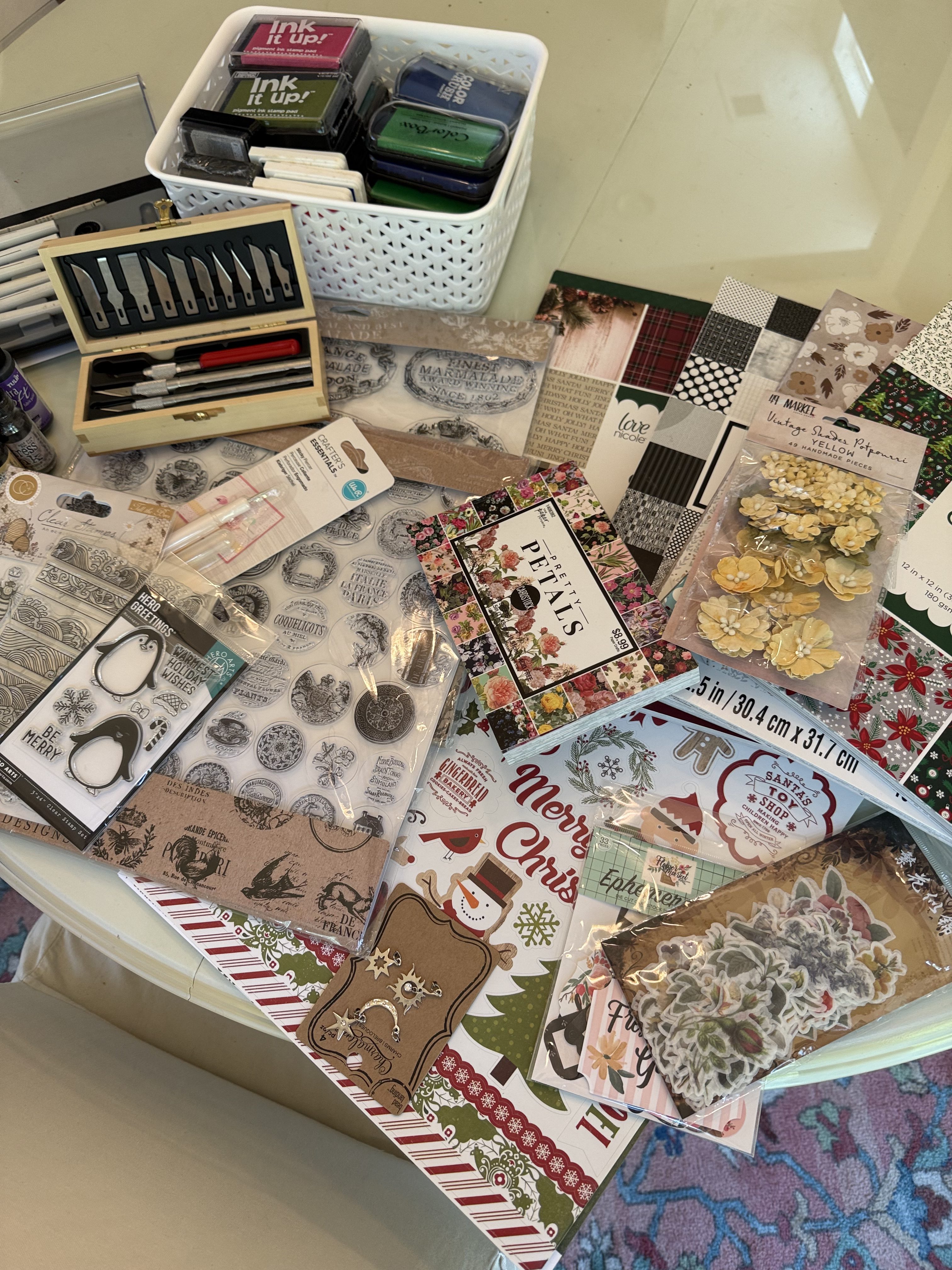
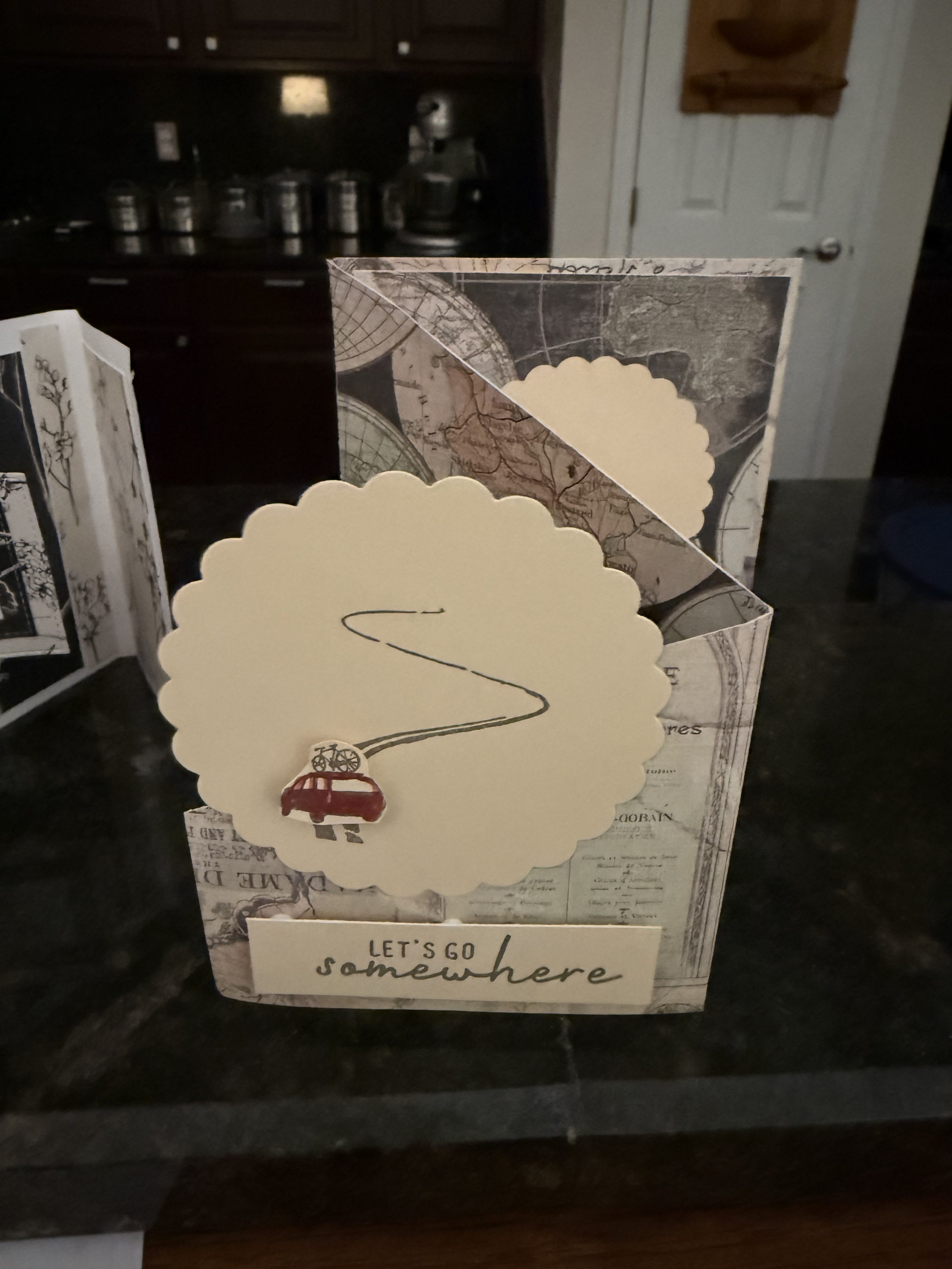
Welcome to the Blog today, Friends. As many of you know, I have found some wonderful thrift store craft items related to card making. Over…
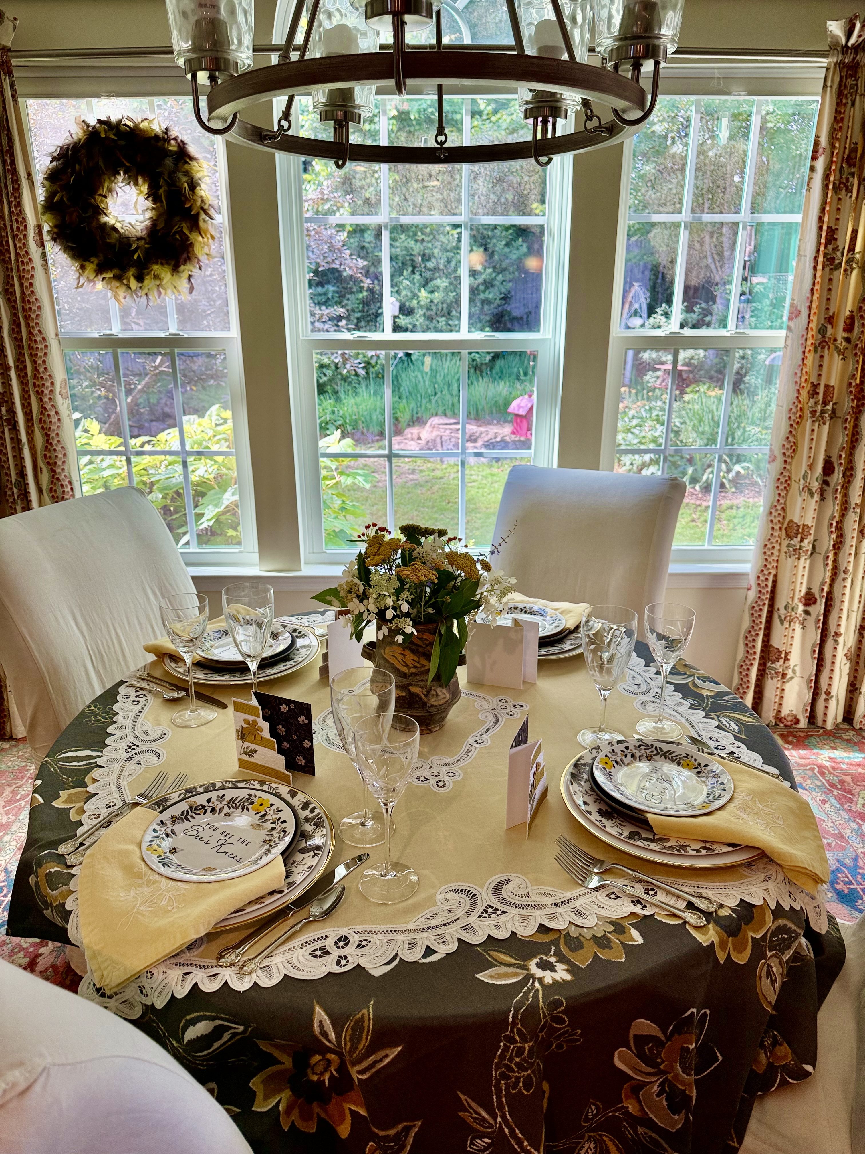
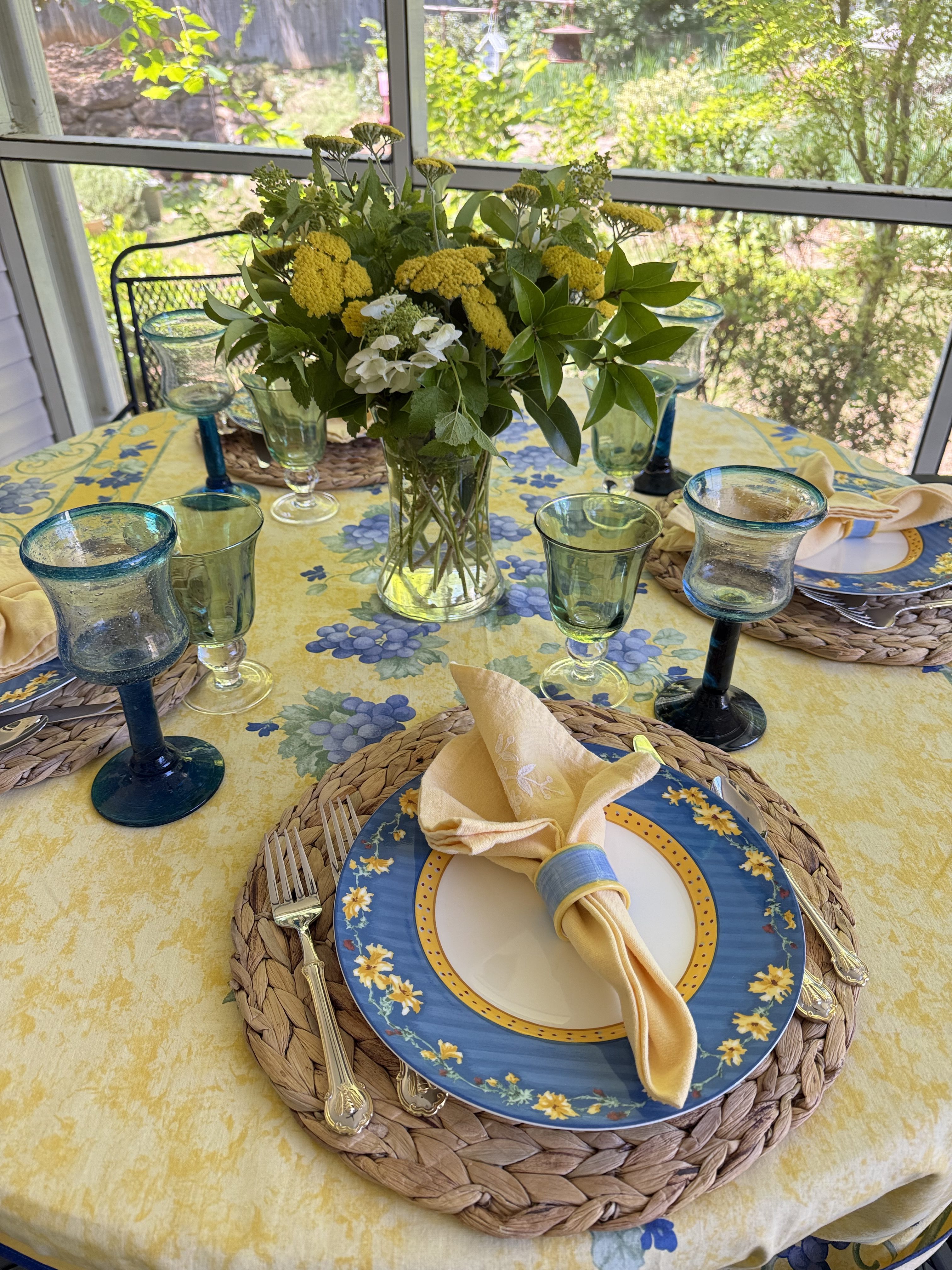
Welcome to the Blog today, Friends. I am so delighted you are here. Today I’m sharing this lovely, almost-summer table setting that captures the gentle…
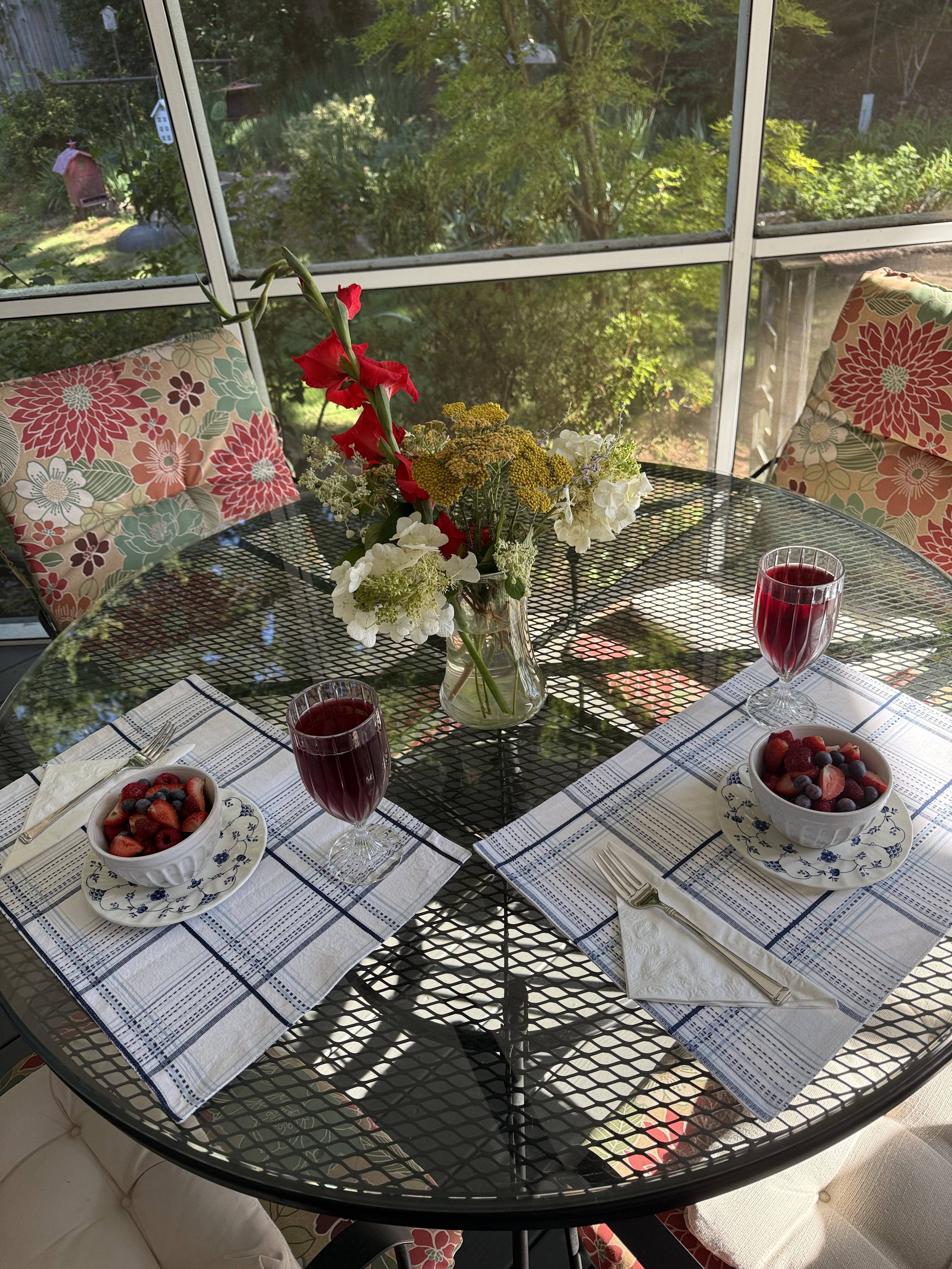
Welcome to the Blog today, Friends. Today I’ll be joining a number of other bloggers to share all things Summer with you. Mary Jo of…
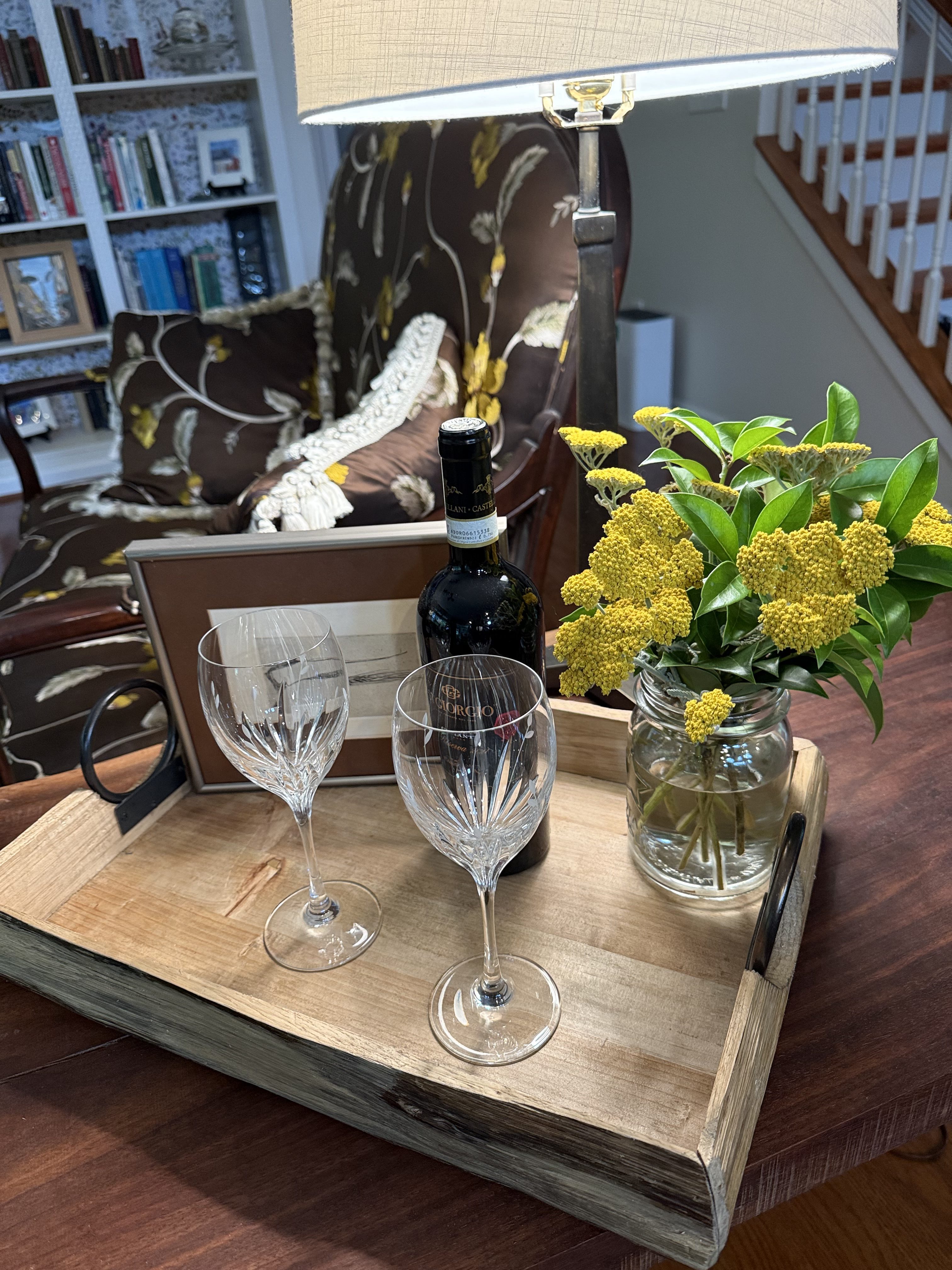
Welcome to the Blog today, Friends. It was definitely time to give the front entranceway a fresh little summer makeover. I was recently gifted these…