Create a Welcoming Summer Vignette for Your Entrance
Welcome to the blog today, Friends. I’m so happy you’ve taken a few moments out of your day to visit. Today, I finally changed the…

Thrifting the Upstate
Welcome to the blog today, Friends. I’m so happy you’ve taken a few moments out of your day to visit. Today, I finally changed the…
Two springs ago, my family and I journeyed to Venice, Italy, a city that seemed to rise from the water like a beautiful dream. From…
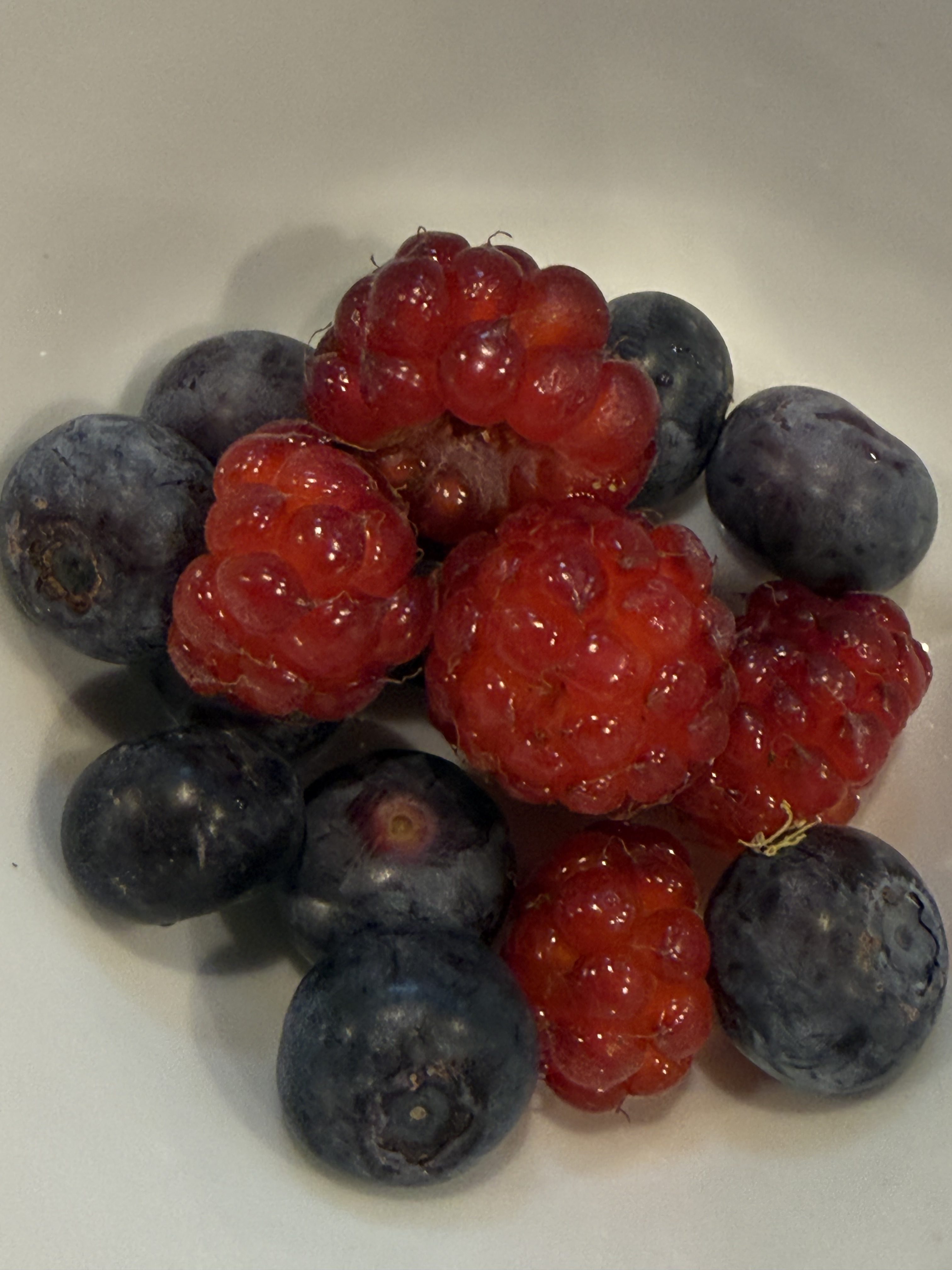
Welcome to the blog today, Friends. I’m so happy you are here. There’s something wonderfully comforting about a morning devoted to baking. Before the sun…
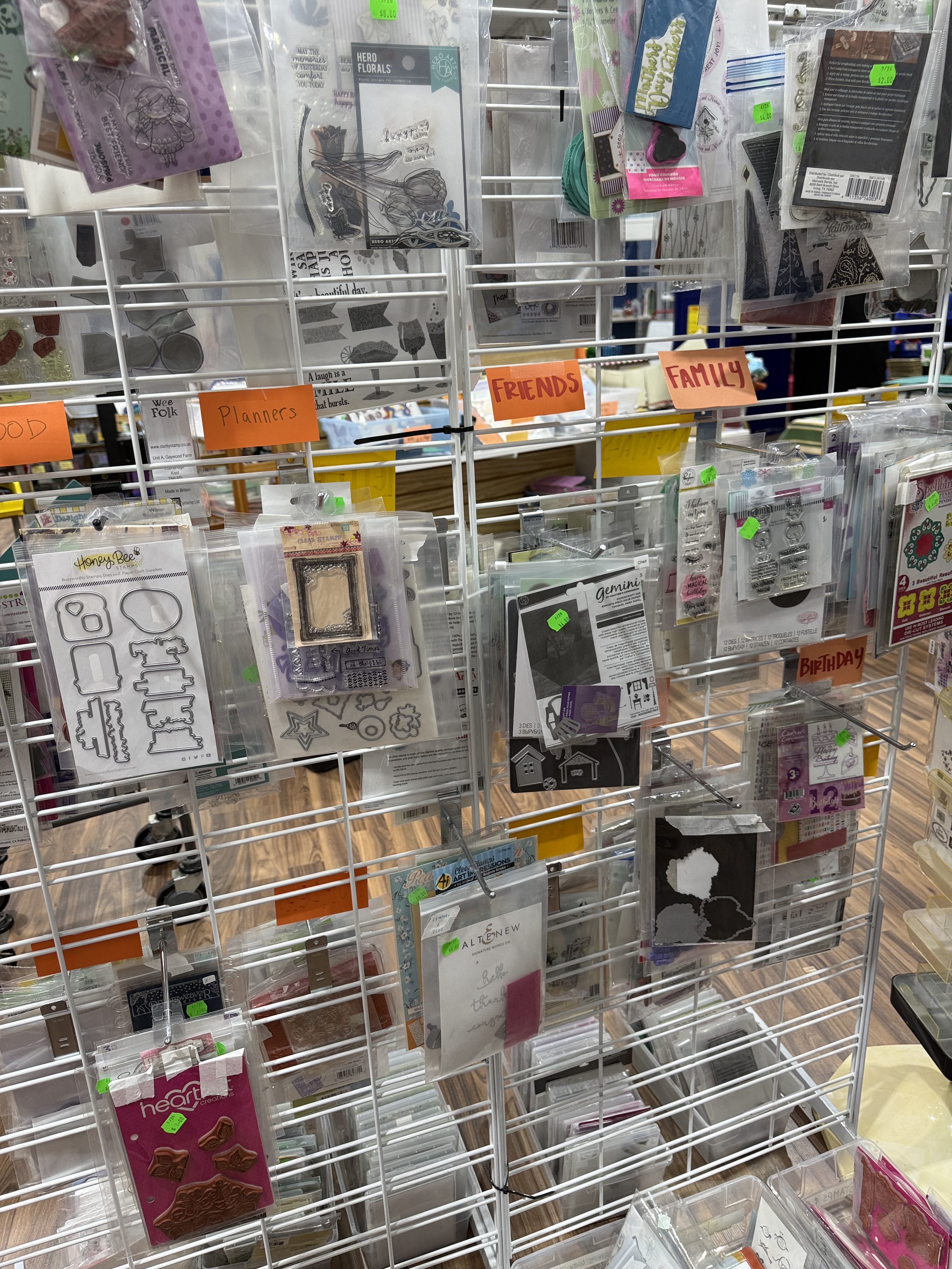
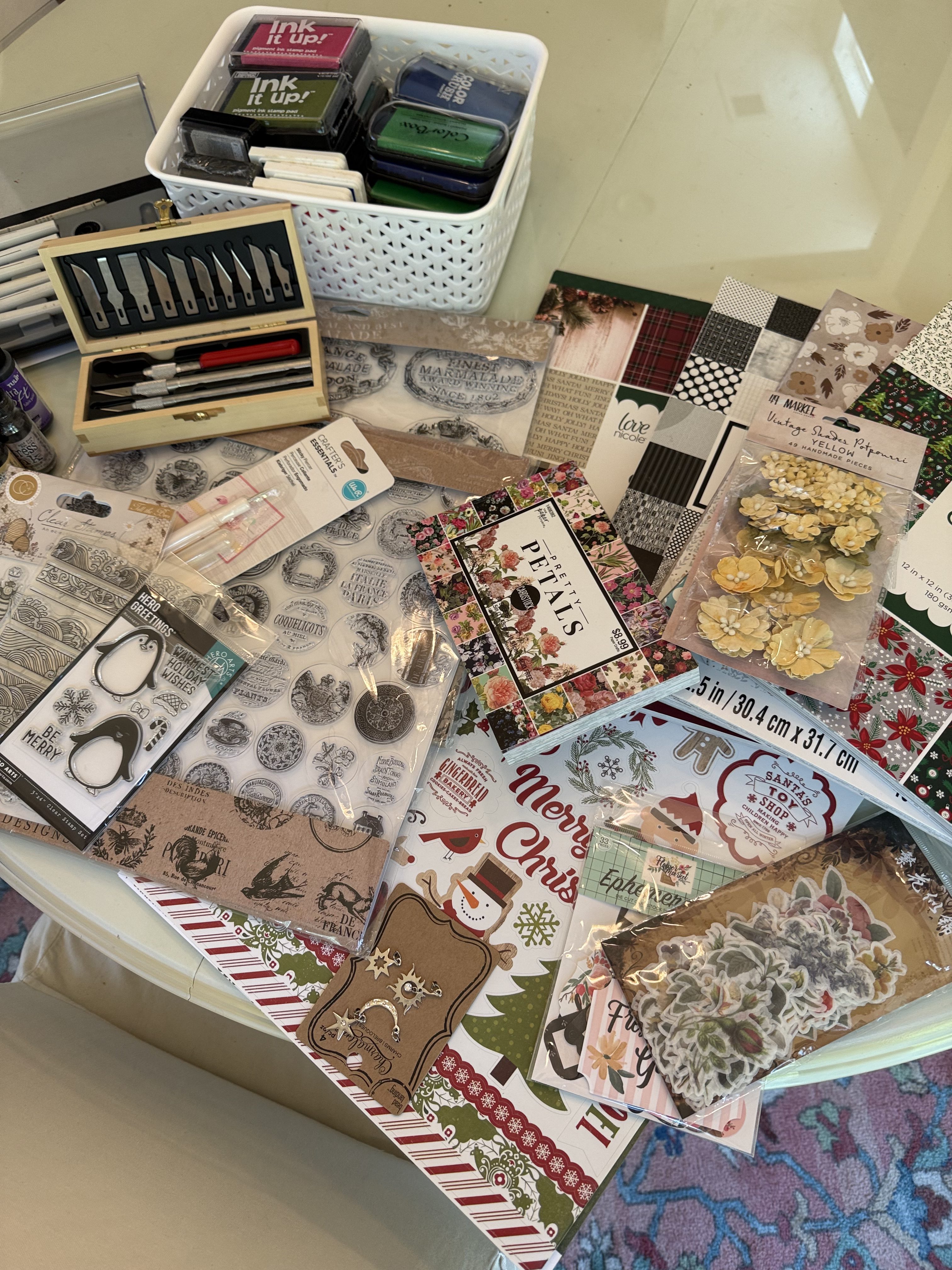
Welcome to the Blog today, Friends! I always enjoy discovering new places to shop, especially when they combine creativity, community, and the thrill of finding…
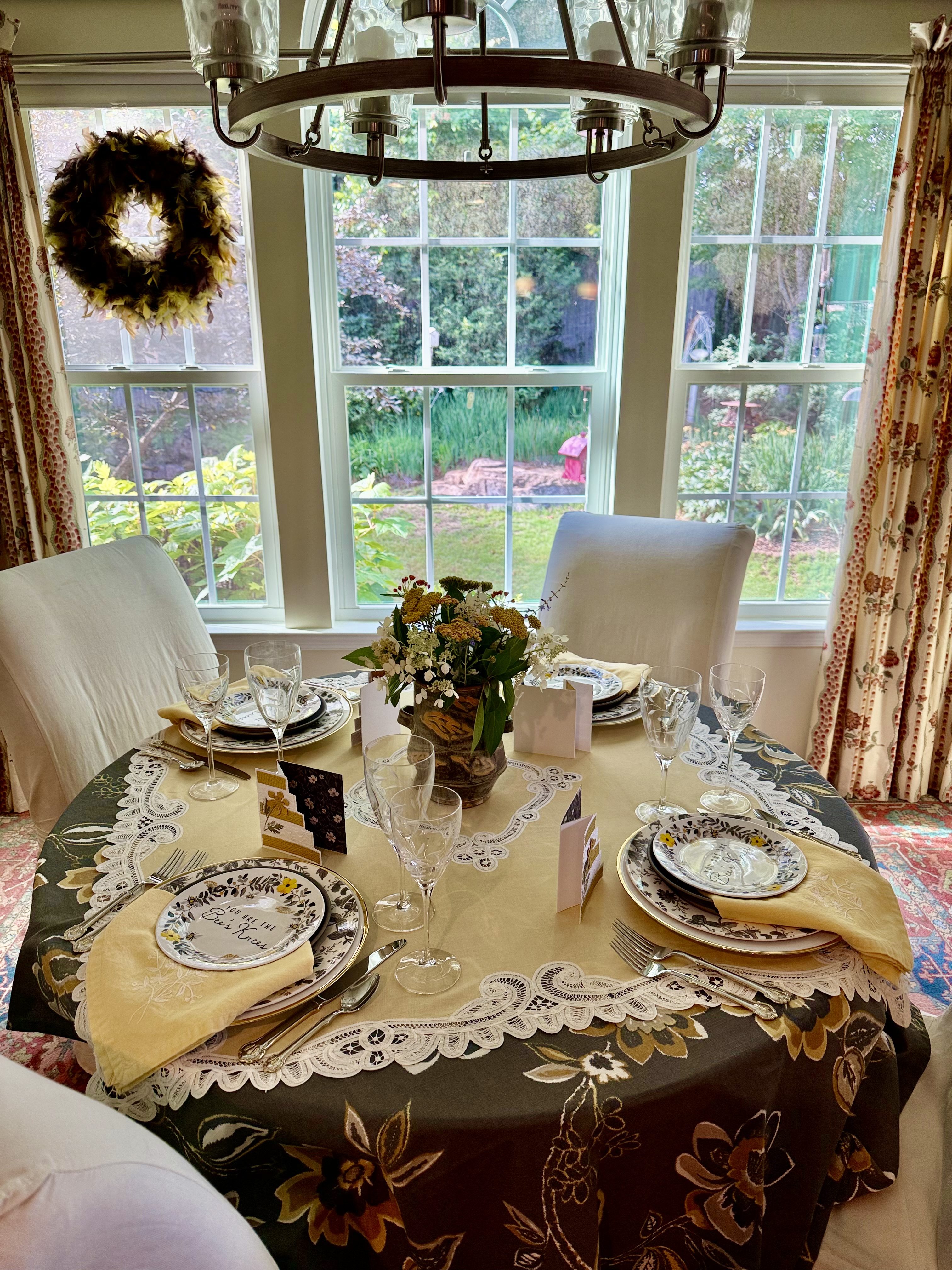
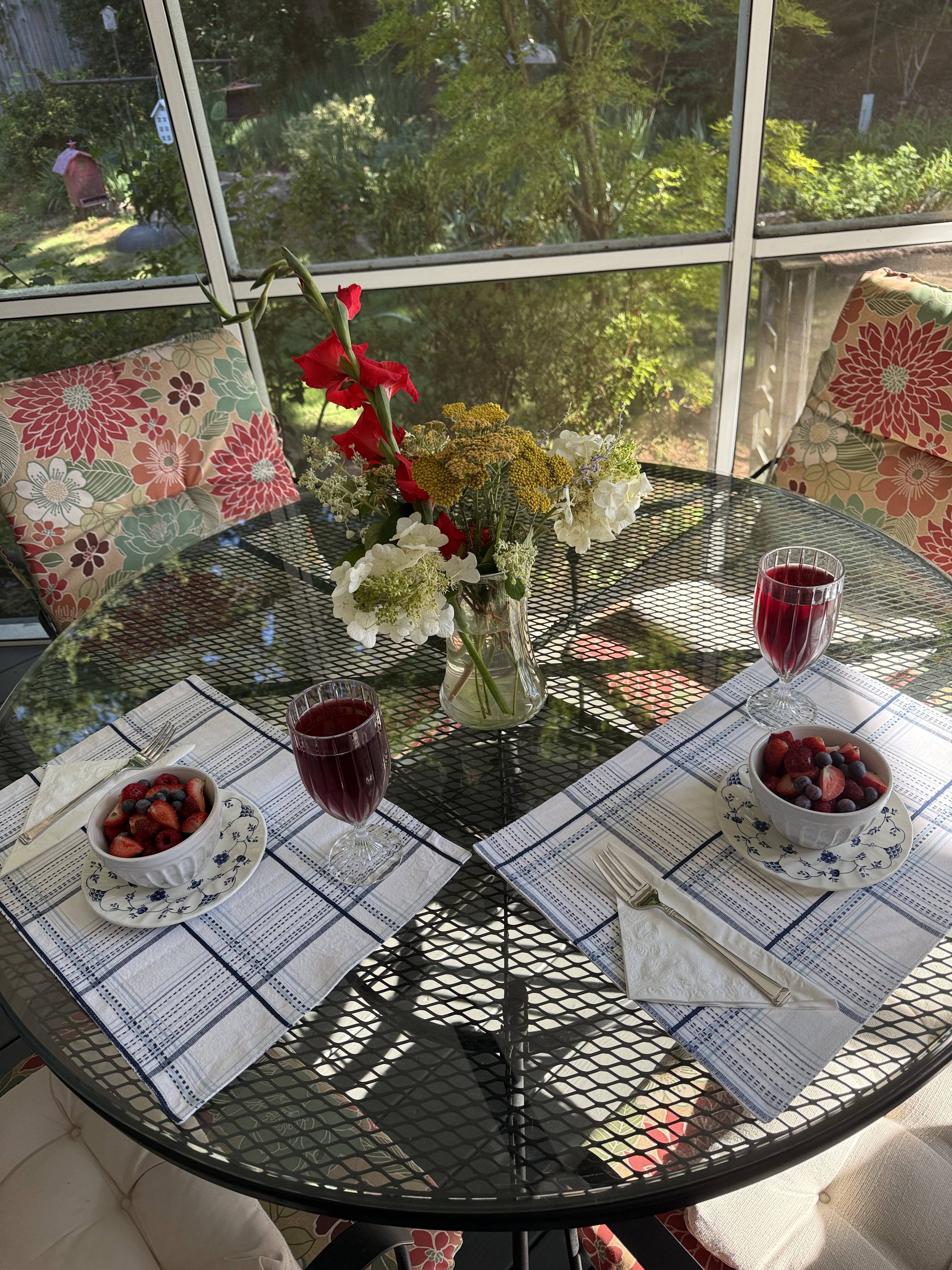
Welcome to the Blog today, Friends! We’re off to the garden for inspiration for a table setting for three. Come join me while we explore…
Welcome to the Blog today, Friends. One of the things I am most often asked about when visitors come to our home is the artwork…
Welcome to the Blog today, Friends! I have a wonderful estate sale adventure to share with you today—one of those treasure-hunting experiences that reminds me…
Welcome to the Blog today, Friends. I’m so happy you’re here. “Your vision will become clear only when you can look into your own heart.” —…
“Why, sometimes I’ve believed as many as six impossible things before breakfast.” — Lewis Carroll Welcome to the Blog today, Friends. I’m so happy you are…
Welcome to the Blog today, Friends. First, let me apologize for being a bit late getting this post out. It has been quite the week…